You built a landing page. You're running ads. You're getting form fills. And then nothing. Leads go cold before you can get them on the phone.
We ran three variations of the same mortgage landing page to figure out exactly why. The results were clear -- but the explanation wasn't what we expected.
Quick Answers
Why do mortgage leads stop responding after submitting a form?
Usually because the confirmation page or follow-up email delivered enough information to satisfy their curiosity before you had the chance to start a conversation. Once a borrower feels like they have the answer, the urgency to talk to a loan officer drops significantly. Response rates can fall from 40-50% to under 20% from this one mistake alone.
What is a good mortgage landing page conversion rate?
For paid traffic, 20-25% is achievable on a well-optimized page that captures contact info before delivering any estimates. Pages that show rate information or payment estimates before the form typically convert at 6-8%. The gap between those two numbers is significant at any meaningful ad spend.
How quickly should loan officers follow up with mortgage leads?
Within 5 minutes of form submission. Response rates drop sharply after the first 30 minutes. The first outreach should always be a text, not an email -- 80-90% of initial lead responses happen via text.
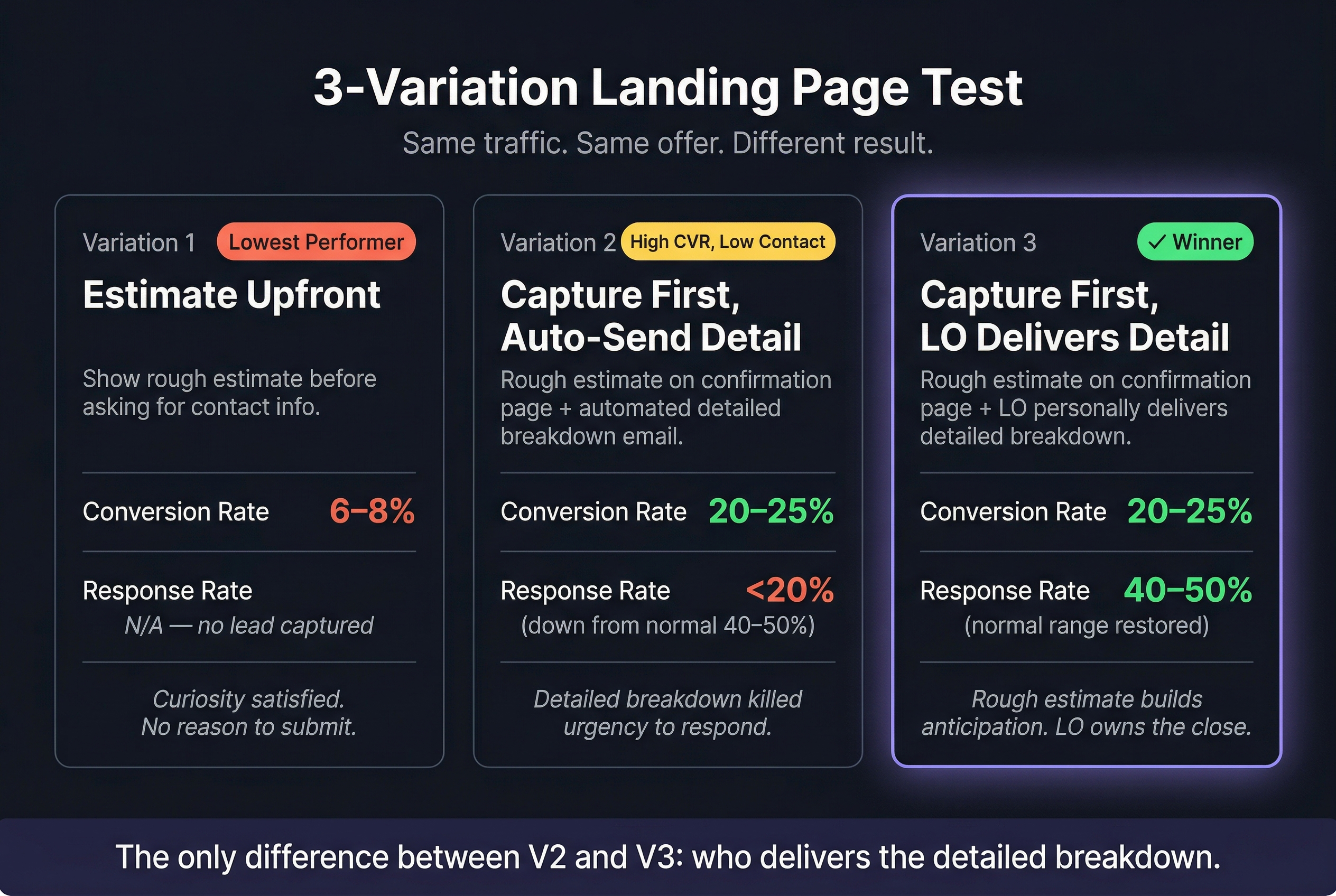
The Three-Variation Test
We ran the same offer, same traffic source, and same ad copy against three different landing page and confirmation experiences. Same everything -- except what the borrower saw before and after submitting the form.
Variation 1: Rough estimate upfront. Show a payment estimate before asking for contact information. The idea was that demonstrating value early would increase trust and conversions.
Conversion rate: 6-8%.
Most visitors got a number and left. The page answered the question before they had any reason to submit. No lead captured, no conversation started.
Variation 2: Capture first, auto-deliver the detail. No estimate before the form. Capture name, phone, and email, then show a rough estimate on the confirmation page and automatically send a detailed payment breakdown by email.
Conversion rate jumped to 20-25%. But response rates crashed -- under 20%, compared to our normal 40-50%.
The confirmation page was fine. The problem was the automated detailed breakdown that followed. Borrowers got everything they needed in the email. No urgency left to pick up the phone.
Variation 3: Capture first, LO delivers the detail. Same as Variation 2 -- capture info, show a rough estimate on the confirmation page. The only difference: no automated detailed breakdown. The LO delivers that in the follow-up conversation.
Conversion rate: 20-25%. Response rate: back to 40-50%.
One change. The rough estimate on the confirmation page builds enough trust to confirm they're in the right place. But the detailed breakdown -- the thing that actually answers their question -- stays in the LO's hands.
Why the Detailed Breakdown Kills Response Rate
It's not that borrowers are ungrateful. It's that the automatic email completed the transaction for them.
When someone fills out a mortgage lead form, they have one core question: can I afford this? The rough estimate on the confirmation page tells them they're in the right ballpark -- which is enough to keep them engaged. The detailed breakdown answers the question completely.
Once the question is answered, the conversation feels optional. They have something to compare. They can shop around. The urgency to talk to a loan officer -- which exists in the 5 minutes after form submission -- is gone by the time your follow-up lands.
This is especially true in a rate-sensitive environment. Borrowers are comparison-shopping. Every piece of data you hand them before the conversation is a tool they'll use to evaluate you against someone else -- without you in the room.
The rule
Marketing earns the conversation. The conversation delivers the value. When marketing delivers the value, it makes the loan officer unnecessary.
What to Put on the Confirmation Page
The confirmation page has a narrow job: confirm the submission, acknowledge what's coming, and keep them engaged until your first outreach.
A rough estimate is fine here -- it validates their decision to submit and builds anticipation for the real conversation. Something like: "Based on what you've shared, your estimated payment range is $X-$Y. We're putting together a full breakdown now and someone will reach out within a few minutes with the details."
That language does three things: shows you have a real process, sets a specific expectation, and creates a reason to stay available.
What it doesn't do: answer the question. The range is wide enough to create curiosity, not close it.
What Actually Works: 4 Landing Page Principles
1. Collect information first -- with expectation-setting language. The form captures name, phone, email, and loan purpose. Frame the submission as the opening of a conversation: "Tell us about your loan and we'll put together a detailed breakdown for you" converts better than "Get your rate" because it sets the right expectation for what happens next.
2. Show a rough estimate on the confirmation page, not a detailed one. The range validates the lead and builds anticipation. The detailed breakdown stays with the LO -- it's the reason to pick up the phone.
3. Follow up by text within 5 minutes. Most leads won't respond to the first outreach. The ones who do respond most often do it within the first 5 minutes, via text. Automate the first message so it goes out immediately -- it should feel personal, not like a CRM blast.
4. One offer, one form, one CTA. Navigation links, secondary CTAs, explainer videos, chat widgets -- everything that isn't the form is a distraction that reduces conversion. The page has one job.
The Follow-Up Sequence That Keeps Response Rates High
Once a lead submits, the goal is to create a conversation -- not deliver information.
- 0-5 min: Text -- confirm receipt, reference the estimate range, tell them someone will be in touch shortly
- 5-15 min: Phone attempt -- not all LOs do this, but it's the highest-conversion window
- 1 hour: Email -- introduce yourself, one piece of value, invite them to reply or book time
- Day 1-2: Follow-up text if no response -- brief, direct, not pushy
- Day 3-7: Email nurture -- content that raises questions, not answers
- Week 2+: Monthly touchpoints for 6-12 months -- most purchase leads are 60-180 days out
The LOs who win long-term aren't the fastest responders. They're the ones whose system is still running 4 months later when the borrower is actually ready.
Key Takeaways
- Showing estimates before the form tanks conversion rates -- 6-8% vs. 20-25% when you capture first.
- Auto-delivering the detailed breakdown tanks response rates -- under 20% vs. 40-50% when the LO delivers it instead.
- The confirmation page is fine for a rough estimate. It's the detailed breakdown that closes the curiosity gap too early.
- Follow up within 5 minutes by text. The window is short. Automate it.
- Keep the form simple. One offer, one ask, no distractions.
Frequently Asked Questions
Should the confirmation page show any numbers at all?
Yes -- a rough range is fine and actually helps. It confirms the borrower is in the right ballpark and builds anticipation for the detailed conversation. The mistake is delivering a precise, complete breakdown that removes the reason to talk. Range = curiosity. Detailed breakdown = conversation closed.
How many form fields should a mortgage landing page have?
Name, phone, email, and loan purpose (purchase vs. refinance) is the minimum for a useful follow-up. Every additional field reduces conversion. Collect the rest once you've started the conversation.
Should mortgage landing pages include testimonials?
Below the fold, yes. Testimonials that compete with the form for attention reduce conversion. Testimonials that appear after the CTA add social proof without dividing focus.
What's the best traffic source for mortgage landing pages?
Google Search (purchase-intent keywords) produces high-quality traffic at higher CPL. Facebook and Instagram produce higher volume at lower cost with lower intent. Both require fast, personal follow-up to convert -- the platform matters less than what happens in the first 5 minutes after submission.
The Bottom Line
The highest-converting mortgage landing pages aren't the ones that explain the most. They're the ones that earn the conversation and then let the loan officer close it.
Capture first. Show the range. Keep the detailed breakdown in the LO's hands. Follow up fast.
That's the sequence that produces 20-25% conversion rates and 40-50% response rates at the same time.